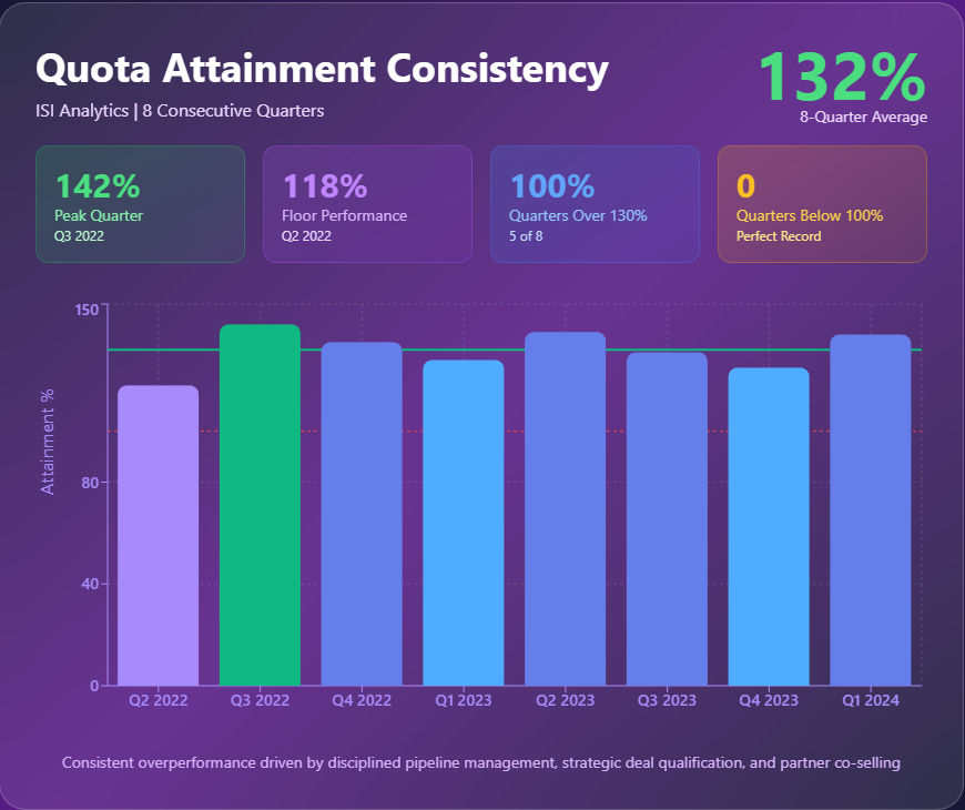
Monthly Quota vs. Total Sales Attainment
This visualization demonstrates month-over-month quota performance compared to total sales, showcasing consistency and growth over time.

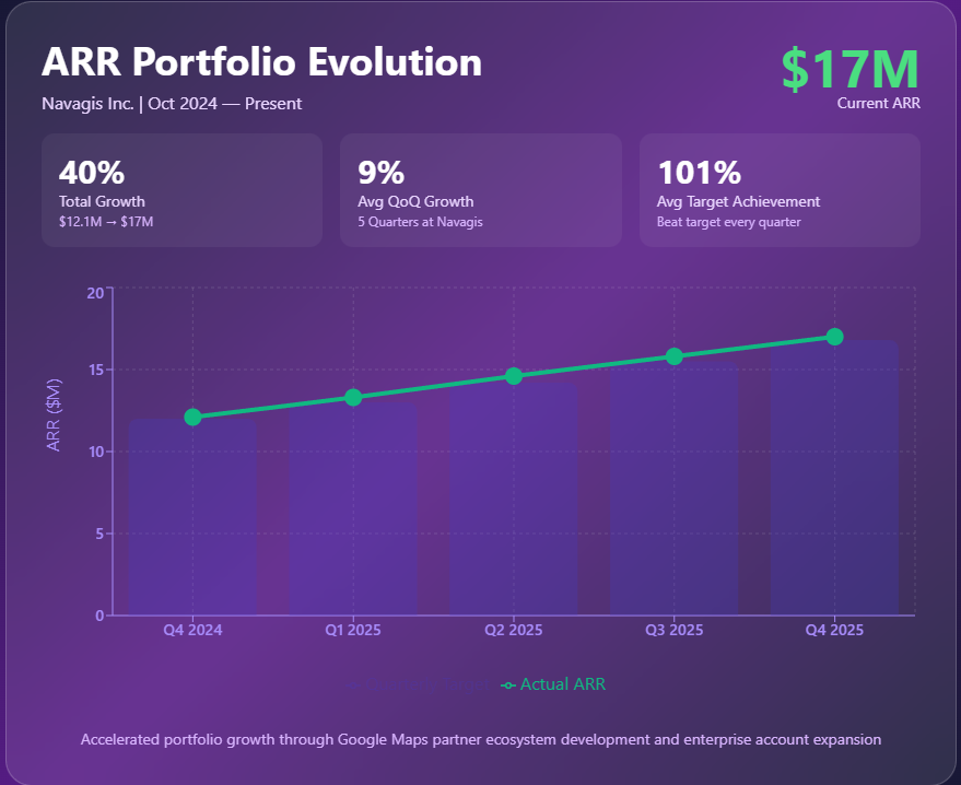
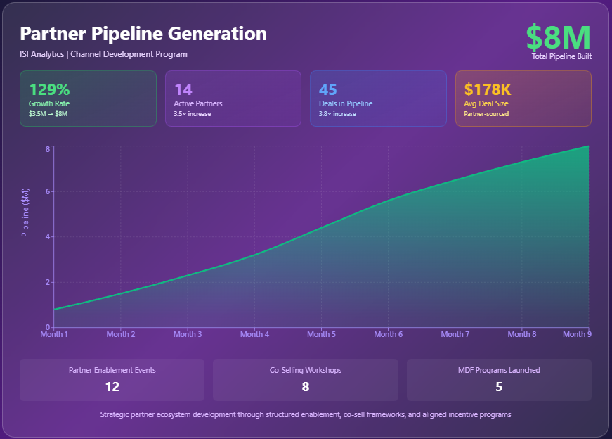
Featured Highlights
Four highlighted visuals that showcase portfolio growth, partner acceleration, partner-sourced pipeline expansion, and quota attainment consistency.
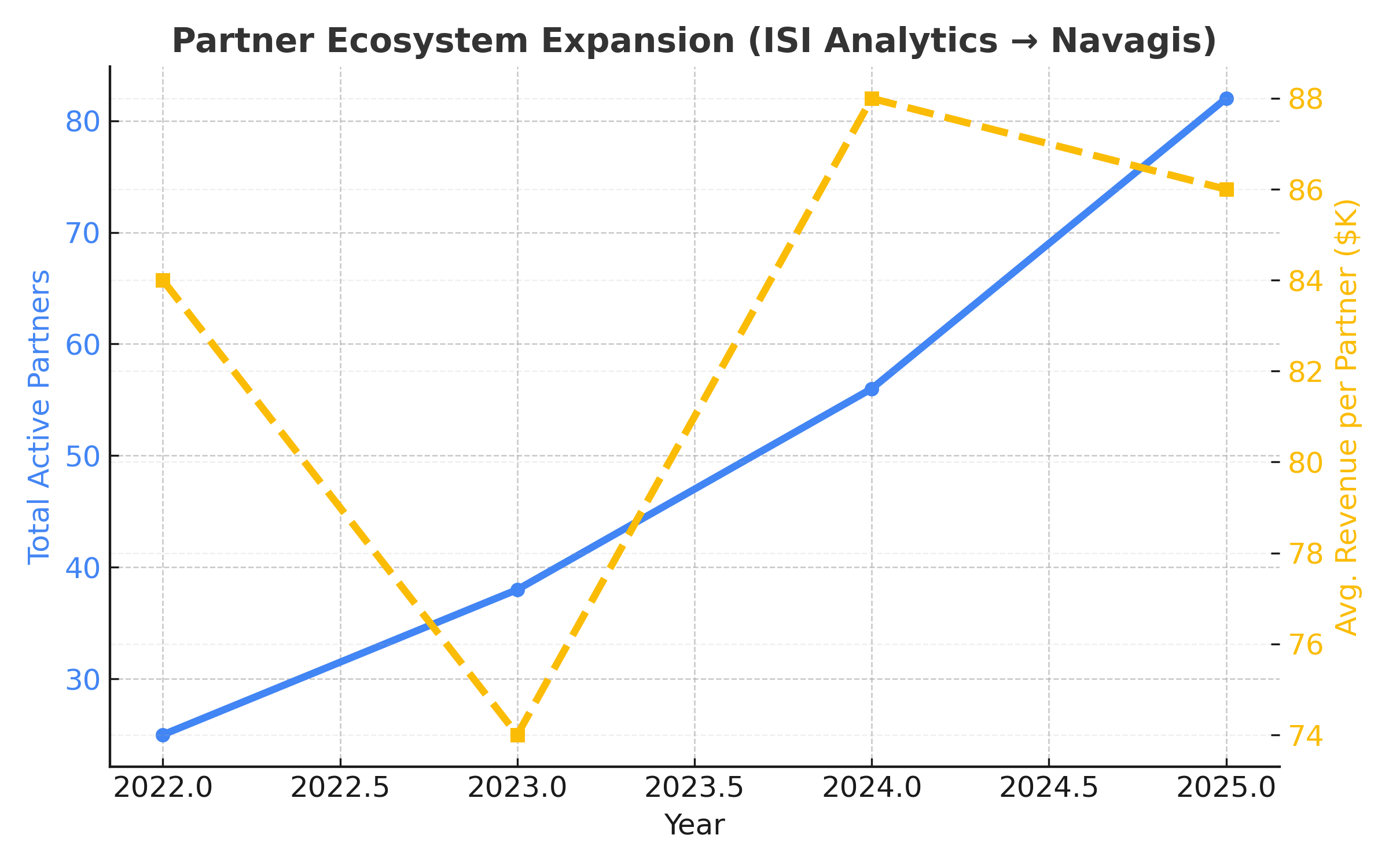
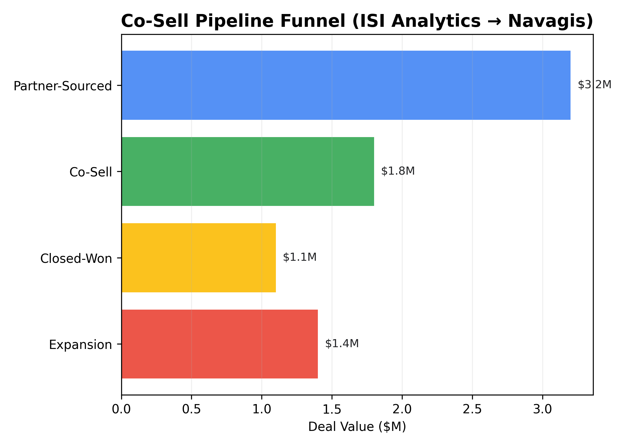
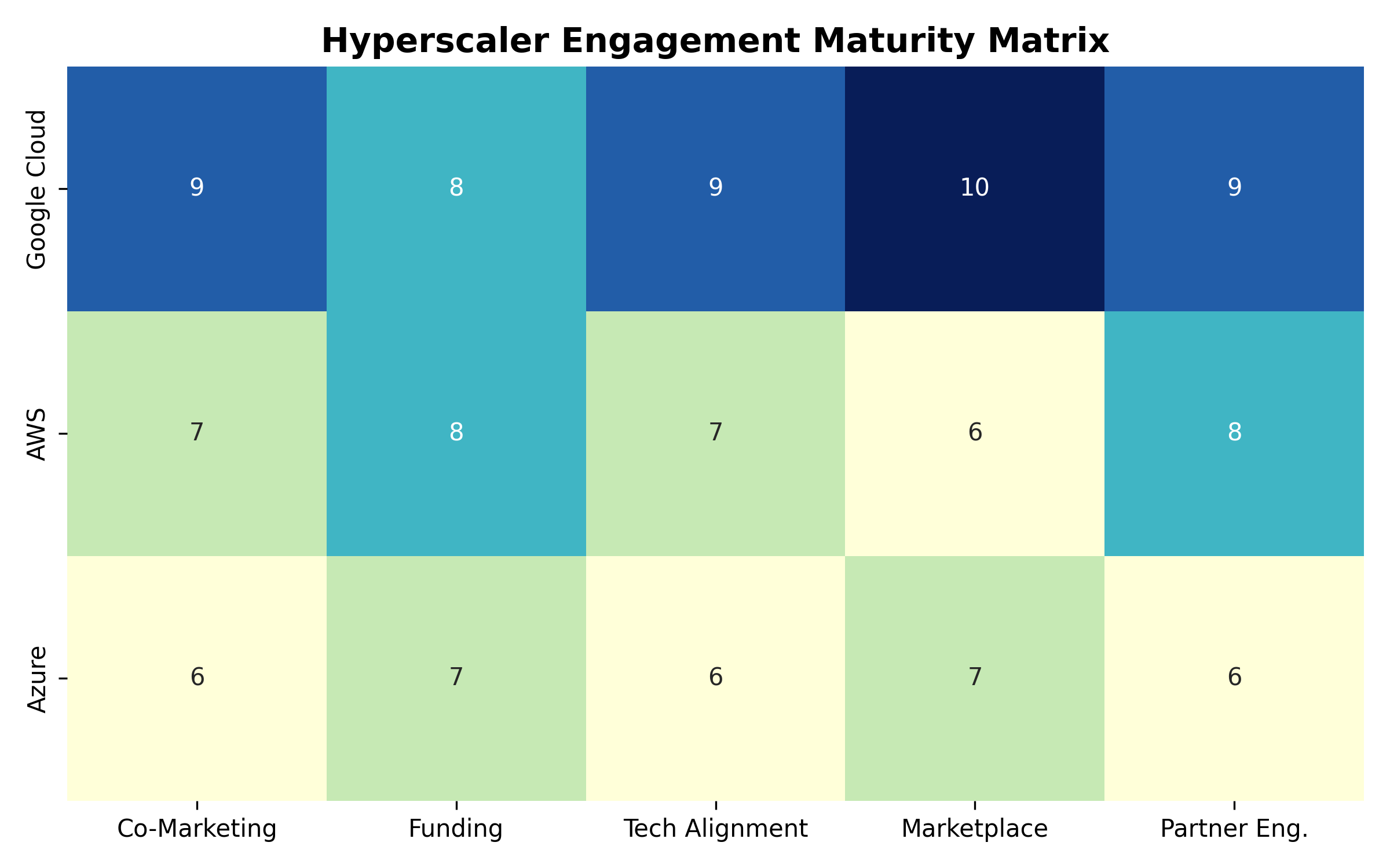
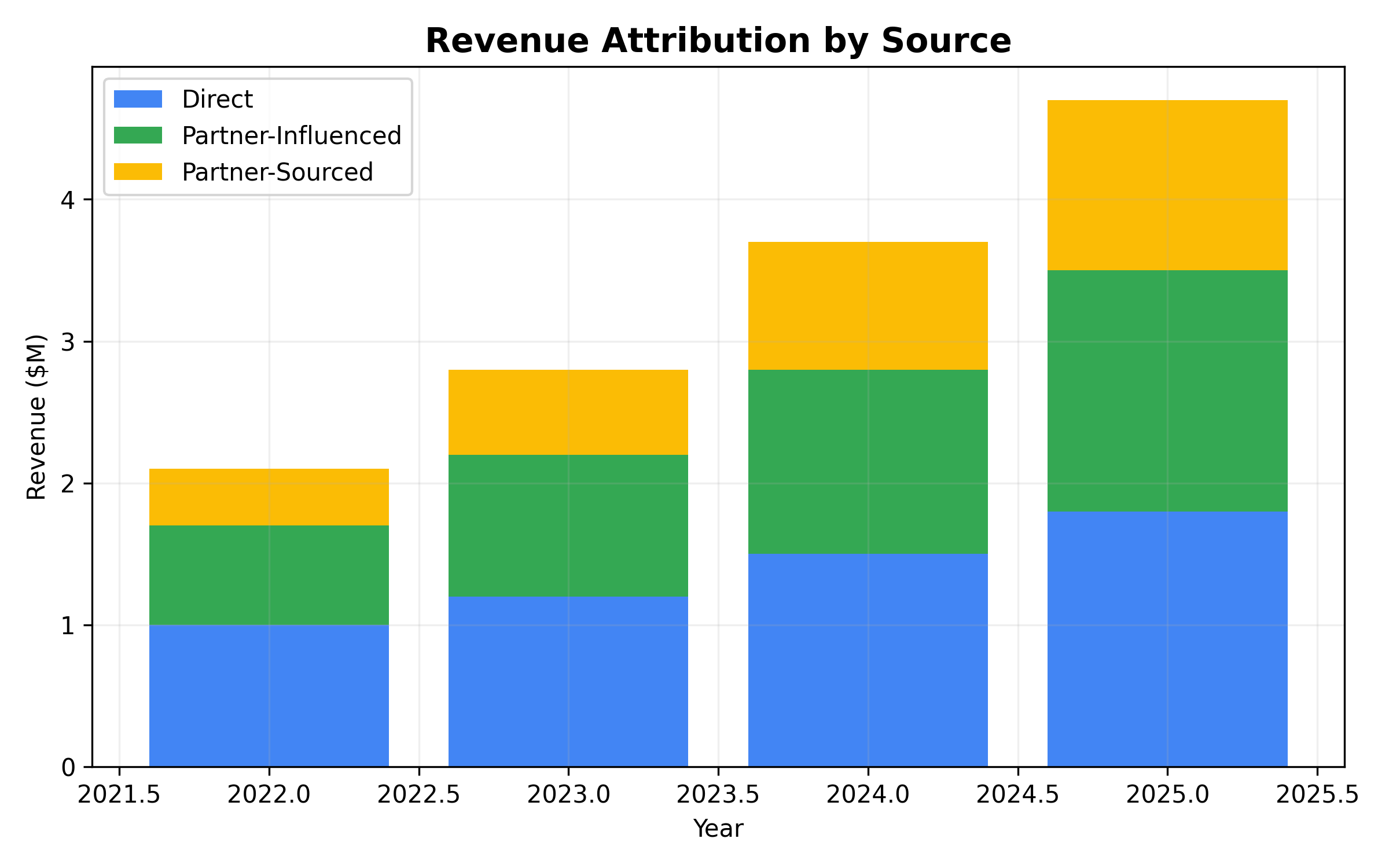
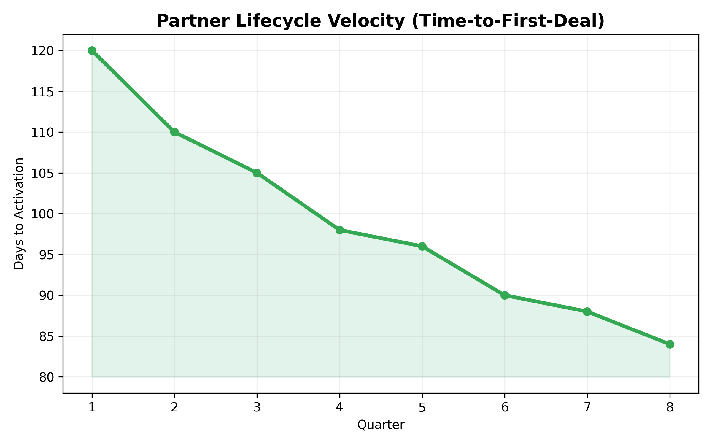
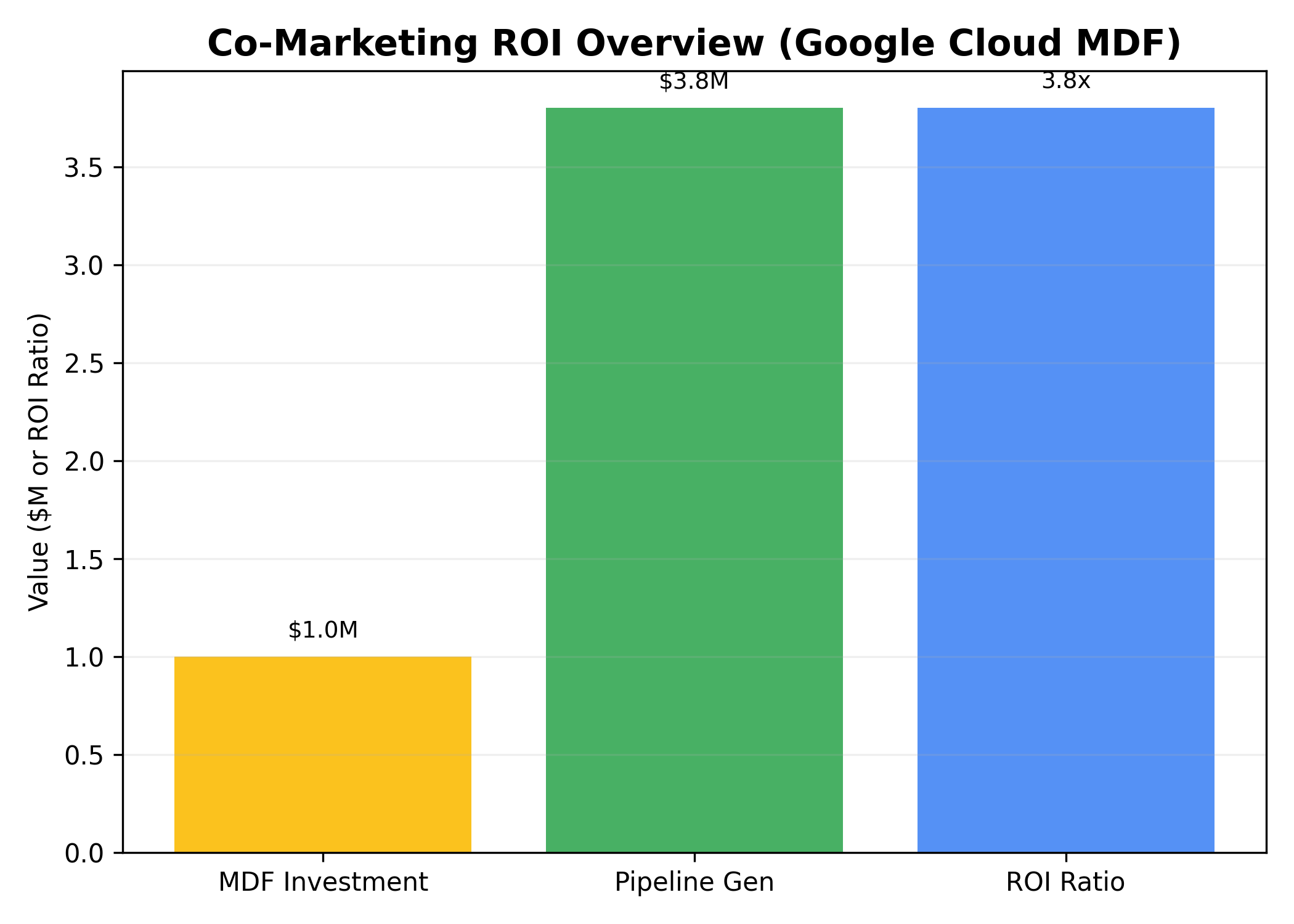
Partnerships & GTM Analytics
Visual summaries of how strategic alliances, hyperscaler collaboration, and co-sell programs have driven measurable growth and partner impact across ecosystems.
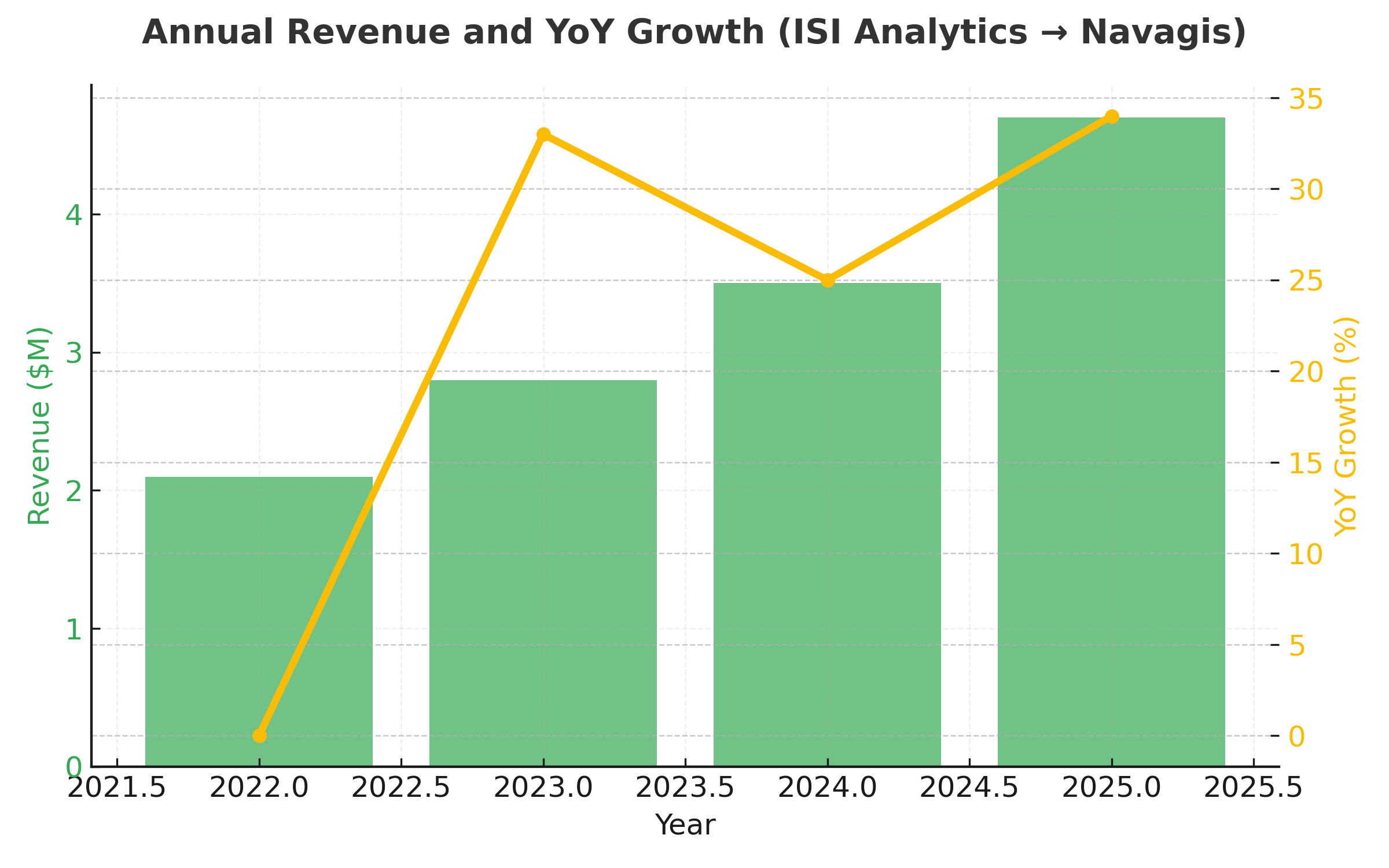
Revenue Growth & Sales Leadership
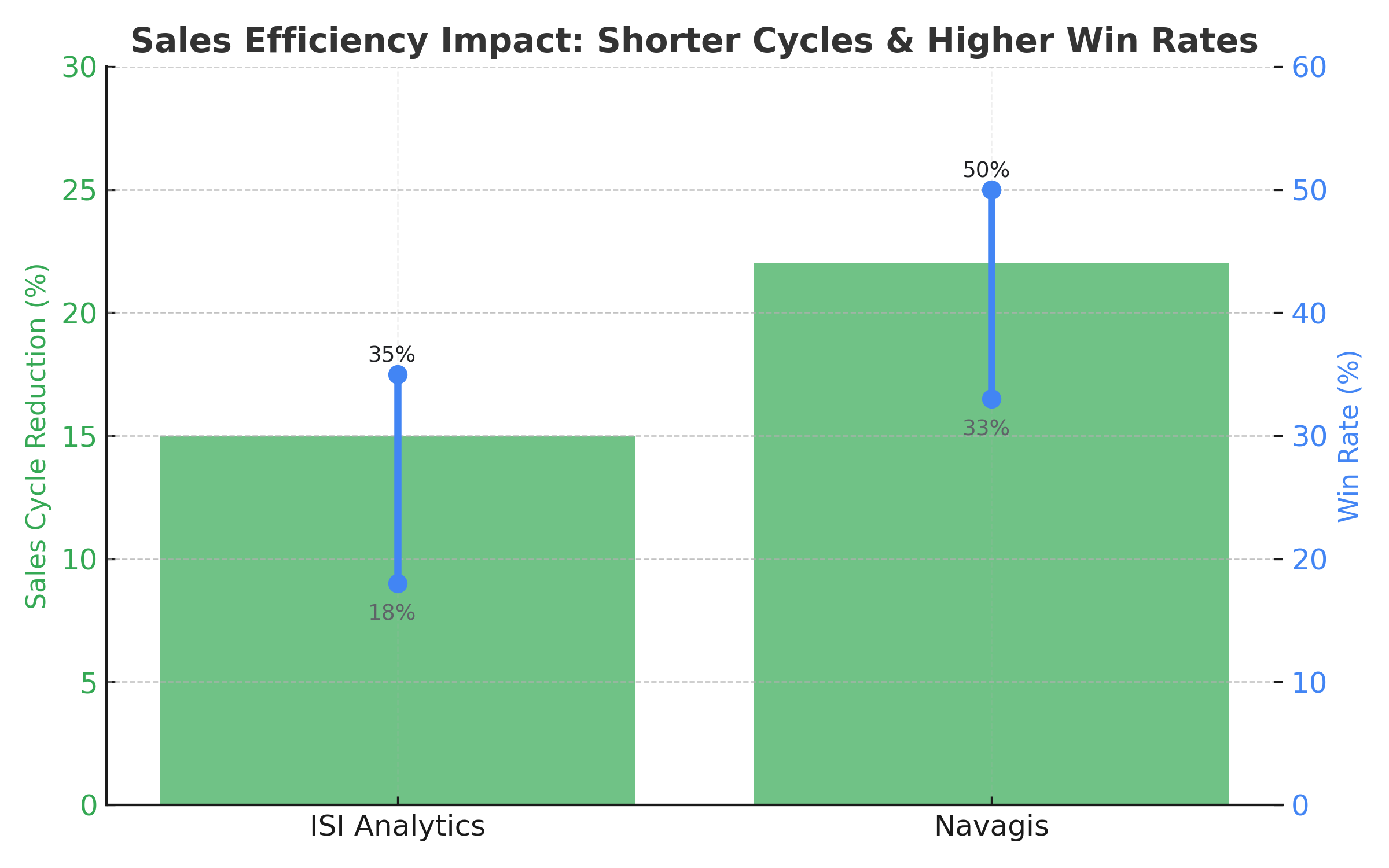
Driving growth has meant expanding into new geographies and industries while balancing the portfolio across net-new, expansion, and partner-influenced deals. The programs highlighted below capture market expansion, healthier product mix, accelerated cycle times, and the win-rate improvements that came from clearer qualification and enablement.
- Elevated annual recurring revenue by simultaneously growing top of funnel and improving YoY conversion from pilot to scale.
- Built a verticalized approach that concentrated coverage on the industries generating the majority of bookings while seeding new logo growth in emerging segments.
- Reduced sales cycle duration and boosted win rates through tighter deal qualification, buyer-aligned messaging, and co-selling with technology partners.